HomeBlogHow to transform your widget testing setup into a widget library with Widgetbook
Widgetbook screenshot
#Engineering
Bas - DeveloperBas de Vaan
August 8, 2023

How to transform your widget testing setup into a widget library with Widgetbook

Recently, I was inspired by a talk from Lucas about Widgetbook. This inspired me to try using Widgetbook in our current projects, while minimising the amount of new code and keeping maintenance costs to a minimum. In this blog post, I will share the approach I came up with.

Key takeaways
  • Widgetbook is a generated UI component library inspired by Storybook.js
  • Usually it is costly for small projects to maintain a UI component library
  • Using Widgetbook in your tests makes it maintenance cost of your UI component library low

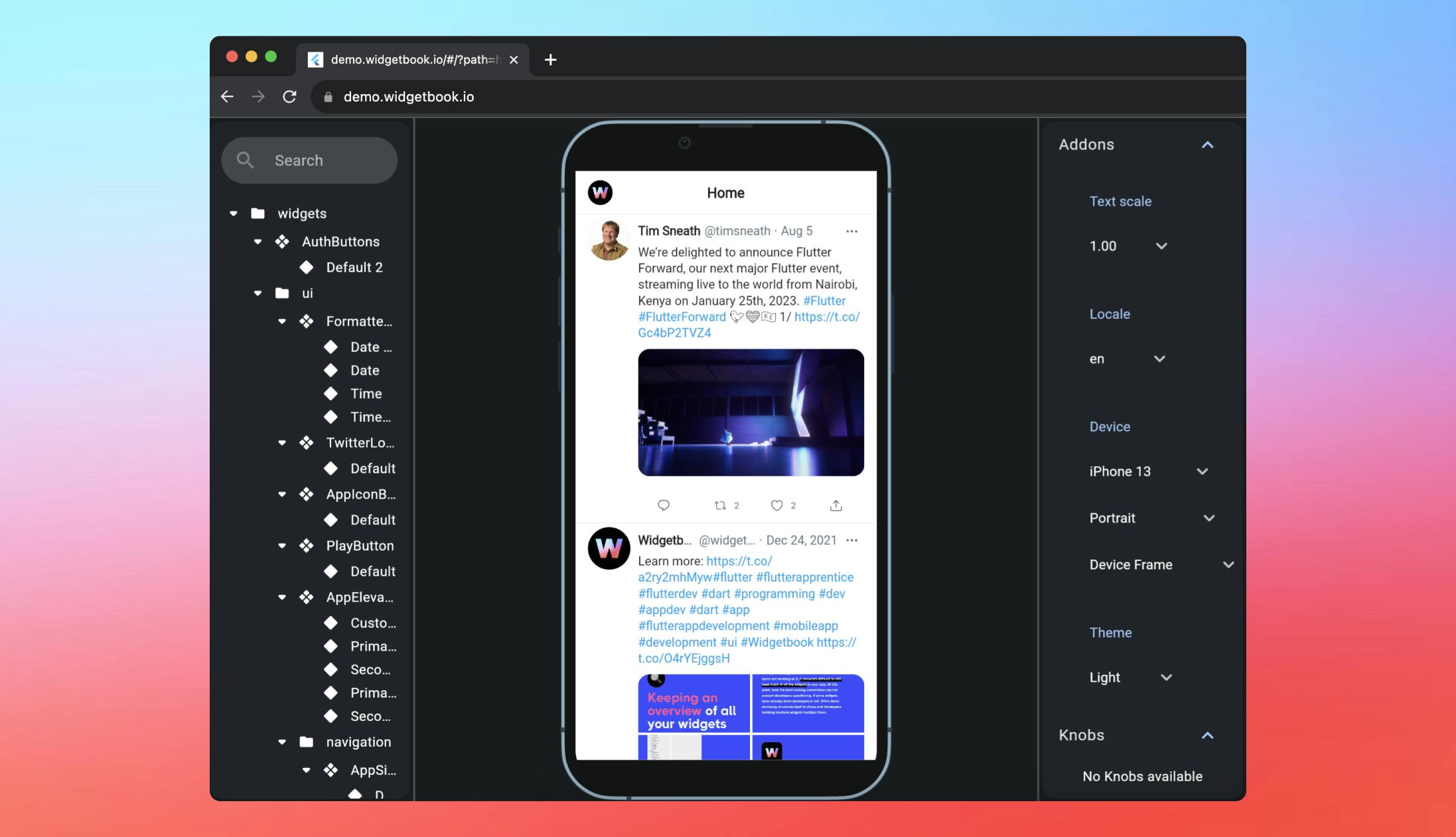
Widgetbook is a UI component library inspired by Storybook.js. It provides a clear folder structure to display various UI components. These components are generated from your actual code, so you can see how they look in your application. The component library is interactive, allowing you to test the behavior of elements to user input, hover, and click. You can also provide different variations and options for your components to make it clear which variants of your elements are usable. You can host this library online to share it with clients, other developers, and designers. If you want to see the potential of a widget book, checkout their online demo here!

The struggle of maintaining a component library

I recall attending a Javascript meetup and listening to a talk about Storybook. I thought, 'This would be great to have in Flutter!' Months later, to my surprise, it actually exists! At a Flutter meetup, Lucas from Widgetbook gave a fantastic presentation about the tool. Its usage seemed easy and promising, with potential in upcoming features. However, the only issue I struggled with was its maintenance cost. For each entry in Widgetbook, you have to define a use case and maintain any changes to your widgets. Here's an example of how to define a use case in Widgetbook:

@widgetbook.UseCase(name: 'with no text', type: TestFieldWidget)
Widget noTextTestFieldWidget(BuildContext _) {
  return const TestFieldWidget(text: '');
}

So while this use case is pretty small, you can imagine if you have a widget with a lot of options this get very cumbersome. This is an example of a bigger widget (still just a simple checkbox):

@UseCase(name: 'basic', type: CheckboxInput)
Widget basicCheckboxInput(BuildContext context, {bool initialValue = false}) {
  return CheckboxInput(
    field: CheckBoxFieldType(
      name: 'checkbox',
      value: context.knobsOrMock.boolean(label: 'checkboxValue', initialValue: initialValue),
      type: FieldType.bulletin,
      label: context.knobsOrMock.string(
        label: 'CheckboxLabel',
        initialValue: 'checkbox',
      ),
    ),
    onChanged: (bool? changed) {
      initialValue = changed ?? false;
    },
  );
}

So you get the gist. To display each element in your Widgetbook, you need to create a function and annotate it as a use case. Fortunately, the Widgetbook code generation tool performs the rest of the magic for you 🔮.

However, obtaining a Widgetbook using this method felt like more work than I was willing to put in. Ideally, I would like to do as little work as possible. This is what led me to the idea of incorporating it with my widget testing.

Combining widgets with testing

I already have a robust widget testing setup in most of my applications. We use both Widget testing and Golden Testing to test the behavior, look, and feel of our widgets. Whenever there is a change, we see the impact reflected in our tests, giving us more confidence in developing new features. If a change in one place has an unintended effect on another widget, our tests turn red and alert us to the unwanted side effect. If you're not already testing your widgets, I highly recommend giving it a try! Golden Tests are low in maintenance cost and feel like low effort for a high reward.

What do these tests have in common with the use cases used by Widgetbook? In both cases, you need to build the widget you want, isolate it from the rest of the application, and provide it to a framework, whether it be Widgetbook's or your testing library's. This led me to look for a way to combine the use cases of Widgetbook with my tests, and I found a 'mostly' working solution!

By just putting the use case functions in the test file itself you can use these functions in your test and annotate them as well. A simple test can look something like this:

@widgetbook.UseCase(name: 'with a lot of text', type: TestFieldWidget)
Widget longTextTestFieldWidget(BuildContext _) {
  return const TestFieldWidget(text: 'A very long test to create a certain amount of text to see how it looks like.');
}

@widgetbook.UseCase(name: 'with no text', type: TestFieldWidget)
Widget noTextTestFieldWidget(BuildContext _) {
  return const TestFieldWidget(text: '');
}

void main() {
  testWidgets(
    "test description",
    (WidgetTester tester) async {
      Widget widget = Builder(builder: ((context) => longTextTestFieldWidget(context)));
      await tester.pumpWidget(widget);
      expect(
          find.text('A very long test to create a certain amount of text to see how it looks like.'), findsOneWidget);
    },
  );
}

It is also possible to provide the initial value of a knob in the function as an optional parameter; this makes it possible to also use the ‘knobs’ in your test. A test for the checkbox that I run in a actual project looks like this:

@UseCase(name: 'basic', type: CheckboxInput)
Widget basicCheckboxInput(BuildContext context, {bool initialValue = false}) {
  return CheckboxInput(
    field: CheckBoxFieldType(
      name: 'checkbox',
      value: context.knobsOrMock.boolean(label: 'checkboxValue', initialValue: initialValue),
      type: FieldType.bulletin,
      label: context.knobsOrMock.string(
        label: 'CheckboxLabel',
        initialValue: 'checkbox',
      ),
    ),
    onChanged: (bool? changed) {
      initialValue = changed ?? false;
    },
  );
}

void main() {
  group('Checkbox Input Golden Test', () {
    GoldenPumpingCompanion companion = defaultPumpingCompanion();

    goldenTest(
      'renders correctly',
      fileName: 'checkbox_input_golden_test',
      pumpWidget: companion.pumpWidget,
      builder: () => companion.buildTestGroup(
        'default widget',
        UseCaseWrapper.wrap((context) => basicCheckboxInput(context, initialValue: false)),
      ),
    );

    goldenTest(
      'renders correctly',
      fileName: 'checkbox_input_checked_golden_test',
      pumpWidget: companion.pumpWidget,
      builder: () => companion.buildTestGroup(
        'default widget',
        UseCaseWrapper.wrap((context) => basicCheckboxInput(context, initialValue: true)),
      ),
    );
  });
}

Please keep in mind that I have some extra test helpers and functions here to assist me in building my tests. This way, even a "complicated" widget test appears clean and moreover provides us with both snapshot tests and an entry in our Widgetbook! Check out my GitHub repository if you’re looking for a simple example project.

Implementing the solution

Okay, I have to confess something. When I said I found a 'mostly' working solution, I actually meant that it doesn't work yet. The code generation of the Widgetbook library cannot correctly handle imports from the test and lib folders. You can fix this by manually adjusting the imports in the file generated by Widgetbook. Remove the imports that start with asset: and replace them with actual imports from your project. This will enable Widgetbook to run, but I don't like making manual changes to generated code. This is especially problematic since it hinders automated deployment of Widgetbook through a pipeline. When I discovered this, I opened an issue about this problem in the Widgetbook Github repository.

I wrote this blog while I was at Fluttercon 2023 (read more about it in my previous blog). At the conference, I had the opportunity to listen to a talk about Widgetbook and check out their booth. The guys from Widgetbook were also in attendance. During the conference, I came up with a possible solution to the problem.

I had the opportunity to discuss my fix and issue with the developers, who were very open and friendly in their collaboration. Overall, it was a great experience 🙂

Bas with the Widgetbook team

While in the progress of writing and publishing this blogpost, Youssef (pictured on the right) actually used my pull request as inspiration and made a fix for Widgetbook!

Widgetbook merge request

So soon in a new release (or in the git ref) you could try this test setup for yourself! Awesome! 🚀

EDIT: On the 18th of August, this feature got released in Widgetbook Generator 3.1.0! So update to the latest version and check it out! 

Wrapping up

Regarding the future of Widgetbook, version 3 has recently been released, which includes many new features and a fully-fledged cloud environment. Therefore, adopting and implementing Widgetbook now seems like a good idea, especially for apps with a large assortment of UI elements.

If you want to know more about how we implemented Widgetbook at Dutch Coding Company or my views on the future of Widgetbook, feel free to send me a message on Twitter (@Bassiuz). I love to discuss all things Flutter :)

You might find this interesting:

Don't let a missing strategy ruin your project. Prevent expensive software never to gain adoption and check if your idea is ready for development. With our Digital Readiness Scan you'll know your next step on the road to succes within 5 questions.

Do the scan