Foodswapp
A user-validated design as a pitch deck for Foodswapp
Design sprint for start-up that helps to prepare healthy meals
Goals achieved
- Pitchdeck to raise funding
- Validated design with users
Services
- Design
A user-validated design as a pitch deck for Foodswapp
Design sprint for start-up that helps to prepare healthy meals
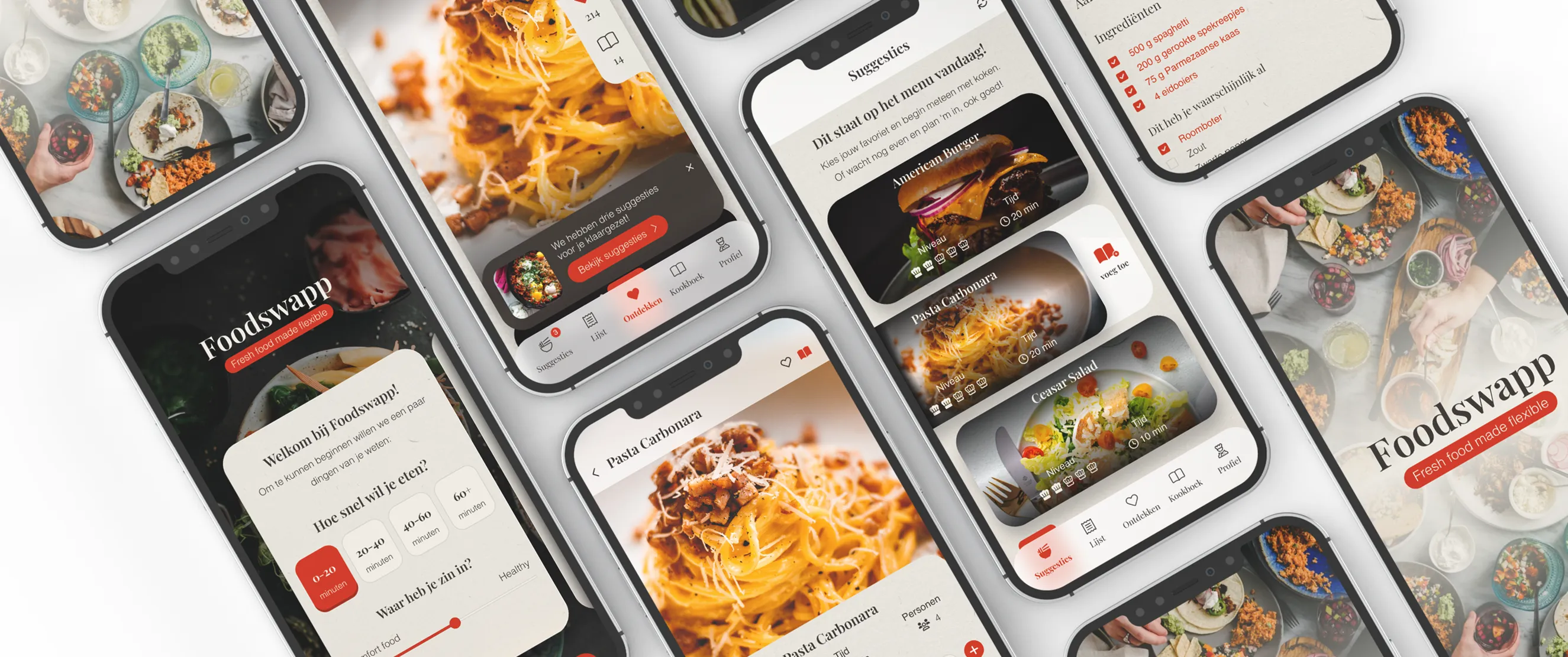
Foodswapp is a startup that was established by David who noticed that people from his age group (20 years + / student age) either do not have time to cook or do not feel like cooking at all. This has put David to thinking of creating something that would trigger this group of people to take on cooking. To address this issue he came with the idea for an app. As a startup they have been busy trying to validate their idea and they have been iterating their value propositions. To validate their idea they have made a conceptual product themselves through the means of Google Forms and WhatsApp. While they were busy validating their idea they were also looking for investors that would fund the concept.
To convince investors during their investor pitch, Foodswapp wanted to be able to visually present their concept and at the same time prove its validity. As a request made to us, they wished to create a prototype and perform a user test to validate the final concept. The request was twofold. The designs were made to validate the idea while on the other hand, the designs would serve as a pitch deck for the potential investors who would fund the concept.
During the kick-off, not only the concept of Foodswapp was shared. We also used this moment to discuss the functionalities on a high level so we could do a proper, qualitative user test. Based on the provided information we have made a design to test the user flow. One of the functionalities we tested with the designs was that app users should use a slider to say whether they were into comfort food or healthy food. Another assumption was that people would like to filter on the total cooking duration of recipes. The designs were used in user testing and we found that the slider was something people were not looking for. They were more interested in putting in the ingredients they felt like eating that day, the cooking duration, and the amount of people they were going to cook for.
In this design case, Foodswapp neither has a branding style guide nor logo, thus we have designed an app that would be visually pleasing and fitting to the concept. As we also would want Foodswapp to accomplish their goal of this design process, our designer got to somewhat freestyle and let the creativity flow while keeping in mind the agreed upon screens for the app.
To stay close to what Foodswapp has in mind, we have asked them to create a moodboard to use as an inspiration for the actual app designs.
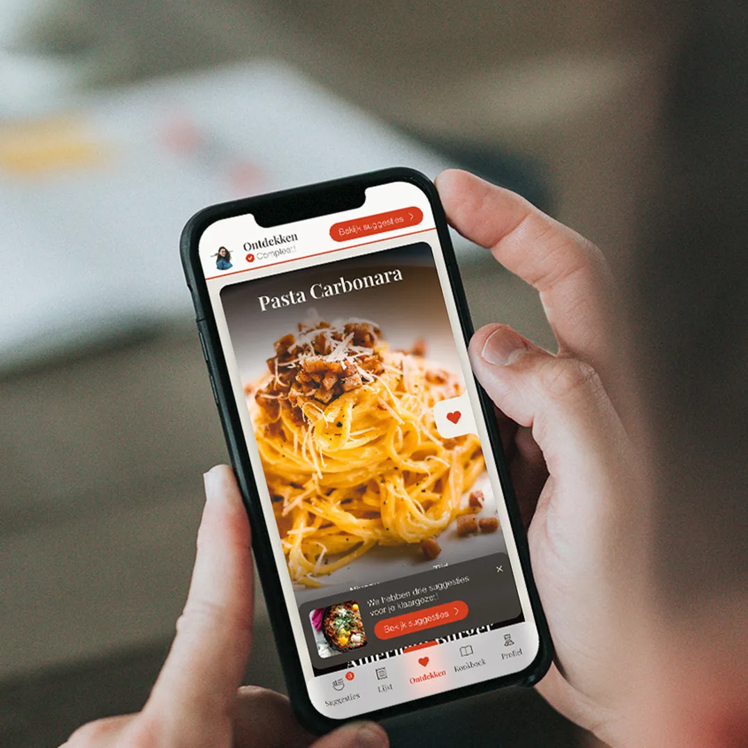
The collaboration was intense in a positive way. There were daily meetings during the design week to align and keep track of the progress made. For the user testing to happen, Foodswapp has delivered a handful of unbiased and randomized people who could be seen as the target audience of the app. The group contained people of the young generation, those who live together (e.g. in a student house), live alone and even one who has never cooked before.
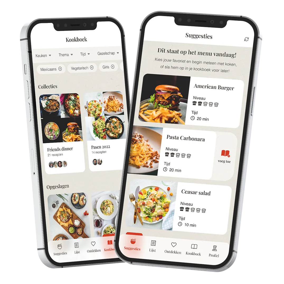
The user test took place digitally which makes it easier in the sense that the test supervisor does not have to actually look over one's shoulder to see what the user is clicking or doing. We sent the designs to the users and asked them to click through it while being asked questions such as; what would you do now, what are you expecting at this moment? The questions asked are to gather honest feedback. It is therefore important to ask open questions and not (accidentally) steer in a certain direction.
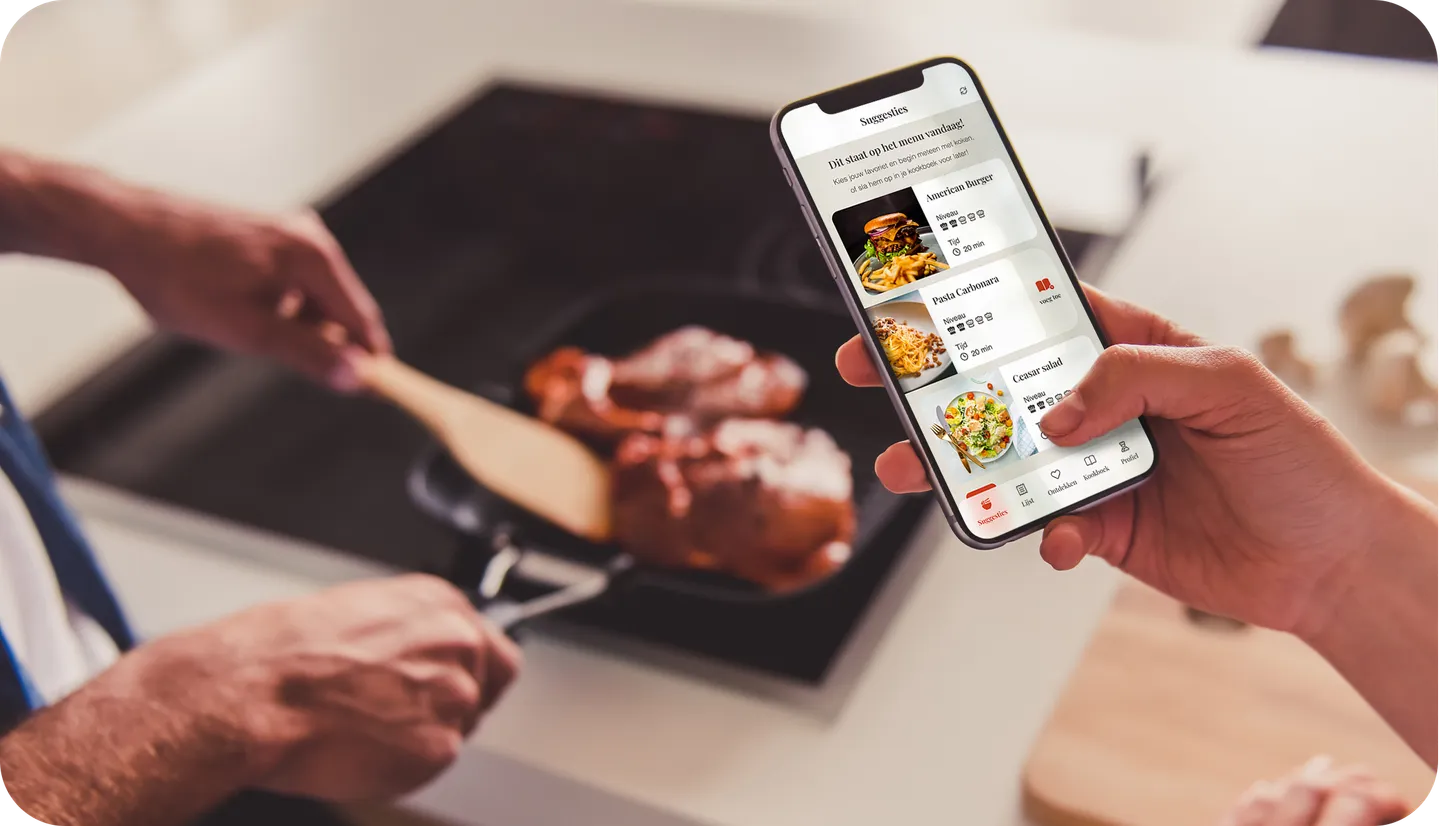
A fun fact to mention within this design case is that our designer has chosen to give the UI an actual print style, using fonts you would usually see in printed publications like books or magazines. Also, the UI is designed with several ‘offline’ textures, such as frosted glass and paper, to give the user an experience of actually having a cookbook at hand instead of an app.
Glenn helped me set up my dream, which is an app that will give people the pleasure of cooking again. I am very happy with the cooperation and the result of Dutch Coding Company.

Get in touch for a no-obligation introduction