HomeBlogResponsive Design in Flutter: meet Fluid UI!
#Engineering #Design
Bas - DeveloperBas de Vaan
June 12, 2023

Responsive Design in Flutter: meet Fluid UI!

At Dutch Coding Company we build more and more apps that are suitable for a wide variety of devices. We’ve of course built a lot of apps for smartphones, but web-apps that need to be visible on bigger screens, smaller screens or next to other windows on a screen are commonplace for our app team now. And let’s not forget smartwatches and tablets! All these devices are incredibly powerful but need to show UI in a different way and with different screen space.

Key takeaways
  • The need for responsive design and apps is still growing. And with the possible target platforms of flutter growing, there is a need for a good solution for handling multiple screen sizes.
  • Utopia is a nice design framework that helps designers and developers cooperate better and create more usable responsive designs.
  • There already is a Figma plugin for designers to use, and an interactive view made to try configurations.
  • Fluid UI is an open source package that takes these principles and makes it easy to apply them in a Flutter app.
  • Fluid UI is still in beta but will heavily be developed on and with. At Dutch Coding Company we will share our experiences about it in the future, so stay tuned!

We’ve been thinking about how to solve this problem. We encounter a lot of problems when a design is made for a certain screen size or multiple different breakpoints, and display the app on a screen that is ‘somewhere in between’. A good example is when we have a nice browser design, but we display the app in a browser next to another browser. This is common behaviour for real power users that sit behind a desk all day, and there are a lot of apps with that specific target audience! But we don’t have time to create a design of our complete app for ‘half a browser’.

A bit by accident we stumbled on https://utopia.fyi. This is a design paradigm where designers work with sizings that have a value in comparison to the width of the screen, and developers can implement these variable sizings in their app. We were quite interested in the idea, and wanted to try it out. My fellow colleague Niels had a nice fluid setup up and running really quickly, and from that point on we expanded on it to a point of where we are able to release the first beta version of our opensource implementation of Utopia for Flutter; Fluid UI!

But lets step back a bit and look at what design principles are most important to us (don’t worry fellow codejunkies, we will get into the actual package later on!)

Fluid Spaces

The idea of a Fluid Space is that the size of a certain space in a design is not set and will vary based on how big the screen is. Let’s say normally you would want a padding around all your content of 24 pixels. This makes sense for your browser but is that fitting for a phone? Probably not at all.

In our code we use sizes on a scale and assign t-shirt sizes to them. This way we make sure we our sizings have a certain consistency in them. Designers like to use these scales too; see for instance this article about why increments of 8 help you speed up your workflow. In practice we set a scale in a file somewhere and use these t-shirt sizes in our app.

But these sizes don’t always make sense on every screen as we said earlier. So what we do with a Fluid Space is choose a minimum and a maximum ‘base’ value, and apply multipliers to them to get the actual size. We also have to determine what our smallest screen and our biggest screen is going to be.

So let’s say our minimum screen is 320 and our maximum screen is 1240. Let’s also say that we think our minimum size of an M should be 12, and the maximum should be 16. We can play with these values to see what ‘looks best’. This results in a table somewhat looking like this:

These multipliers can be tweaked as well; but let’s just analyse what we have here. Whenever we use a small padding on an object (with the sizing S), we would normally always see 8 pixels around it padded. But with a fluid size, this padding gets shrunk a bit to 6 pixels. You won’t notice it that much, but if you have a lot of items with padding on the screen it will make a big enough difference that together, you will. If we use a larger value to, for example, choose the height of a block or an image, it will change a lot more. In the case of XXL it will change 20 pixels in size when comparing the smallest to the biggest screen. Which will make it fit a lot better.

But what happens when we don’t have a screen with either the smallest or the biggest size? We calculate where we exactly are in between and use the value at the same percentage in between our min and max. So for example a screen that is of size 800 is at about 52% of our scale, which will make the size of an M about 12,08.
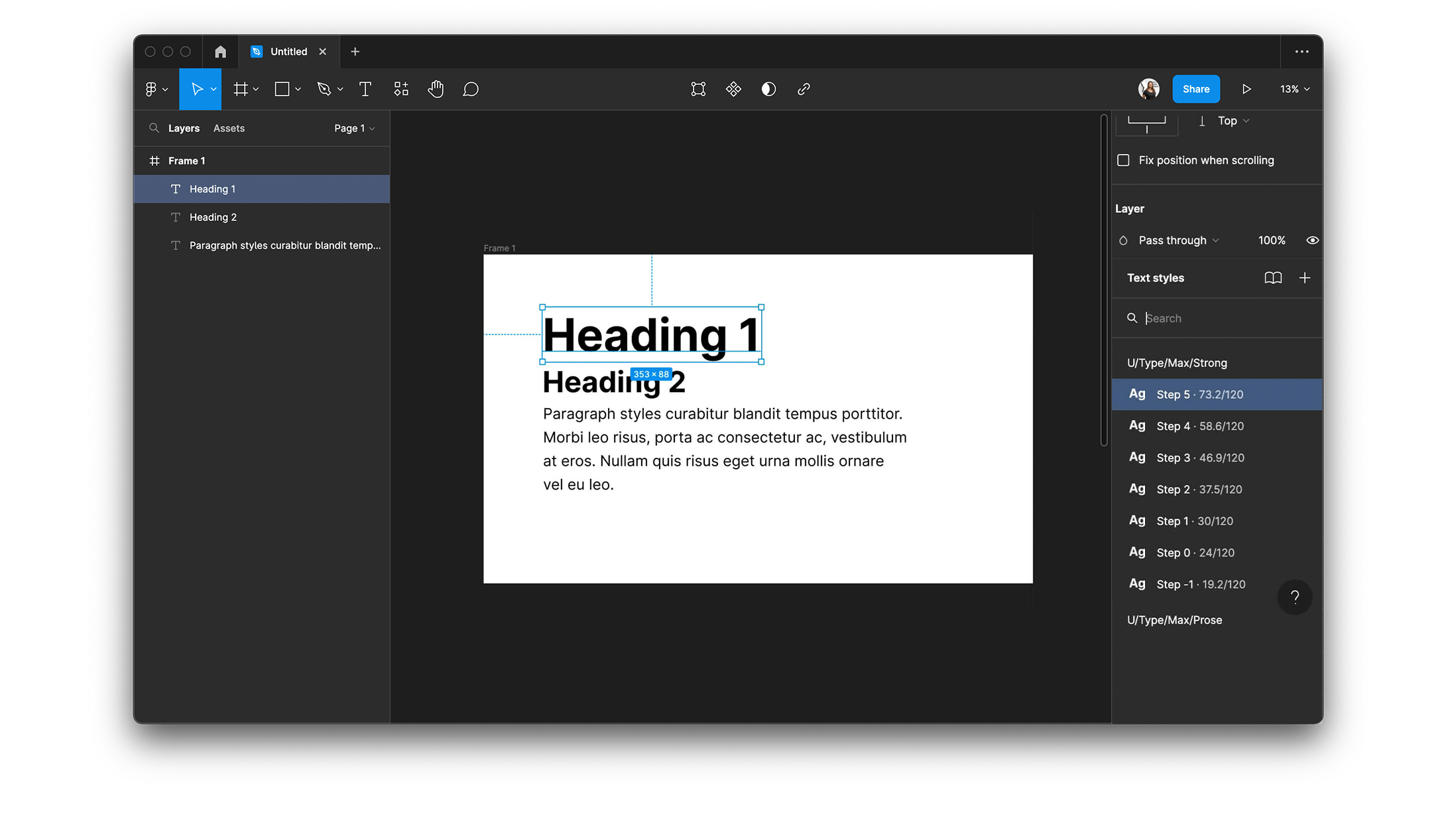
Fluid Types

Fluid Types are very comparable, but are used to define scales for typography. The difference in size between a body text and a title of a page defines how a page with text looks. On a small screen, there is not much room for emphasis, while on bigger screens there is!

So instead of using a linear scale, we use an exponential scale for typography, to make a bigger impact on the difference in type scales. The fun thing is, we only have to define our min and max screen size, and for both a font size and a type scale; and that’s it. This is all we need to build a scale for font sizes.

Figma

If you are a designer and want to try this, you actually can! There is a Figma plugin developed by the team of Utopia to help you implement this way of designing apps. This plugin helps you with setting up the configuration of the scales, and in reusing all sizings of spaces and typography! There is even a Kickstarter project available to start your design with.

null

If you want to know more about Utopia you should really check out their site https://utopia.fyi. I especially liked their YouTube video’s, as they explained the problem and solution to it very well. Let’s move over to the technical part!

Using Fluid UI in Flutter

Well fellow developers, I hope you kept reading until this part, because this is where the fun (for me at least) really begins. We set some goals for ourselves in creating this package;

  • It needs to be able to use all the same settings and values our designer is going to come up with.
  • As for features, we wanted to start with Spaces, Space Pairs and Types, as these felt as an essential backbone of the design paradigm.
  • We wanted to have a very easy way of implementing it in our apps.
  • Preferably we wanted some kind of playground to test settings and see what we can do with the framework.

We think we achieved most of these goals in our first beta release on Github, go check it out if you’ve finished reading 😄

Setup

The Setup of Fluid UI in your project is really easy. We built everything you need into a Theme Extension that can be created with a very simple constructor. But if you want to define certain things in your scale it is easy to do that with this constructor.

FluidConfig config = FluidConfig.fromContext(context);

    return MaterialApp(
      theme: ThemeData(
        extensions: <ThemeExtension<dynamic>>[
          config,
        ],
      ),
      home: const MyHomePage(),
    );

Above is shown a very easy way of setting up the basics of Fluid UI. If you have this setup, you can already use the default sizing scale functions and build a type scale! But preferably you want to implement your custom scale that the designer made.

FluidConfig config = FluidConfig.fromContext(context,
        spaceConfig: SpaceConfig(
          baseMin: 4,
          baseMax: 8,
          xxxsModifier: 0.25,
          xxsModifier: 0.5,
          xsModifier: 0.75,
          sModifier: 1,
          mModifier: 1.5,
          lModifier: 2,
          xlModifier: 3,
          xxlModifier: 4,
          xxxlModifier: 6,
        ),
        typeConfig: TypeConfig(
          minBaseFontSize: 16,
          maxBaseFontSize: 20,
          minTypeScaleModifier: 1.2,
          maxTypeScaleModifier: 1.5,
        ),
        viewportConfig: ViewportConfig(
          minViewportSize: 320,
          maxViewportSize: 1200,
        ));

    return MaterialApp(
      theme: ThemeData(
        extensions: <ThemeExtension<dynamic>>[
          config,
        ],
      ),
      home: const MyHomePage(),
    );

Easily implemented

On the GitHub page a lot of examples are shown in how to use Spaces, Space Pair and Type Scales, so for detailed examples check the Readme over at GitHub. But just to show how easy it is, this is how you create a SizedBox with a variable width;

SizedBox(height: context.fluid.spaces.m);

Whenever you change the size of your browser with the Flutter Web app in it, the size of this box will animate accordingly. You don’t have to write any functional code or handlers, this package will make sure whenever the box is rebuilt, it will be built for the correct screen size.

At Dutch Coding Company we use Google Fonts a lot; it’s a very easy way of implementing fonts in Flutter and it gives us access to a big library of usable fonts. We made an easy way to get a type scale variant of a Google Font;

Text(
'Hello internet!',
textStyle: context.fluid.fromGoogleFont(GoogleFonts.firaSans).bold.displayLarge);

This function will return a TextStyle that can be put in a Text widget as shown here. It can show both regular and bold and in all ‘sizes’ that are used in a TextTheme in flutter. So from BodySmall to DisplayLarge and anything in between. The copyWith function can be used later to alter some characteristics such as color or line spacing if needed, so usage is very easy 🙂.

Playground

null

We wanted to have a nice demo app to play around with, see some different type scales and fonts; and that is why we added the FluidUI Playground as the example app to the GitHub repository. You can check it out yourself or just check on our web app online! In this playground you can set your own settings and see how a basic layout is impacted by screen size changes and configuration changes. You can later use these exact configuration in your own project. If you want to see the code for this playground, you can check it in the example app on Github!

WDYT?

Well that’s basically it for our first version of Fluid UI! We are going to try this way of working very soon in a real project at Dutch Coding Company to see if we like it and will share our experiences. But we are also very curious about what you think of this approach? Is this going to be as nice for the designers as for the developers? Are there things we forgot in our implementation? Please let us know. You can send a message to me personally, you can find my contact details below. A message on Twitter will also always be answered; follow me on @bassiuz!

You might find this interesting:

Don't let a missing strategy ruin your project. Prevent expensive software never to gain adoption and check if your idea is ready for development. With our Digital Readiness Scan you'll know your next step on the road to succes within 5 questions.

Do the scan