 Glenn Bergmans
After the plans for the fdtrck had been crystallized, it was time to turn the idea into an app. A key aspect of any digital product is the interface. The interface, or design, determines how the user interacts with the product. If the interface hampers, is unclear, or makes it hard for the user to perform any task, users will drop out. This however does not only depend on the look and feel of the app, but also on more abstract concepts such as navigation, flows, and button placement.
Wireframes
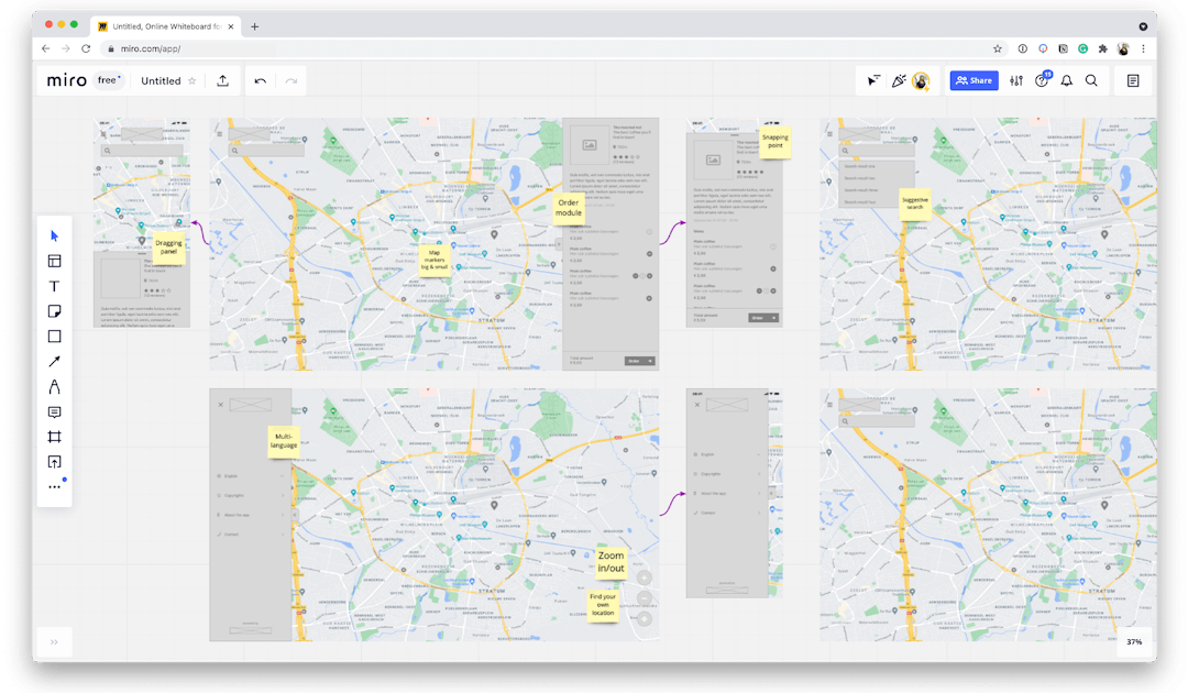
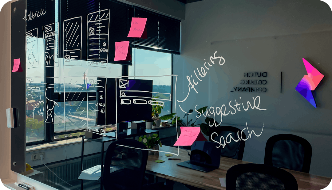
To nail the flow in the app, we always start with wireframing. A wireframe is essentially a line-drawing of the app, focussing on functionality rather than looks. In fact, we usually try to make them as blend as possible to prevent sub-par designs from distracting from the real questions at hand: how should the app work? The result is a full sketch of the app, including all screens and buttons that form the navigation between these screens.
Important note: since we develop both for small and big screens using Flutter 2, we also wireframed for small and big screens. You know, it’s not the size of your screen that matters, it’s what we do with it. And we had to keep in mind that users will use touch devices (such as phones and tablets) and pointer devices (computers). If you want to run on all devices, you should design for all devices. That is, if you want a quality app, of course.
Adding some color
Okay, so now we have an app that’s super easy to navigate. It just looks like it was designed on a napkin. Our apps look better than that (we swear), so let’s add some color, fonts, a brand, icons and align everything properly. Let’s make it sparkle ✨.
Now, we have to make a confession: we’re not a branding agency. We don’t generally design logos, choose fonts and colors. Branding is not only about the visual identity, but rather also about the story, core values, tone of voice and so much more. We are good at designing interfaces (is it okay if we brag a little?), which we can definitely do in accordance with a brand. For fdtrck however, we went a little out of our comfort zone and designed a brand from scratch, because we won’t go to the market anyways. We hope you like it.
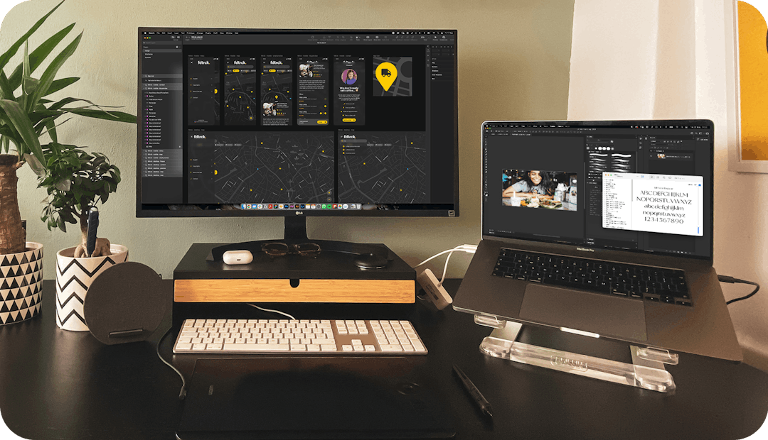
When it comes to designing the UI (that’s short for User Interface), we in essence take the wireframes and apply the brand to it. It’s important to, more or less, keep buttons and other key elements in the same place, as the positioning creates a visual hierarchy that is important when people scan the page.
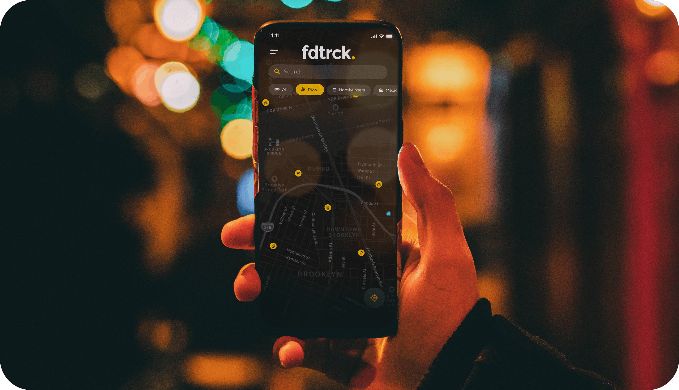
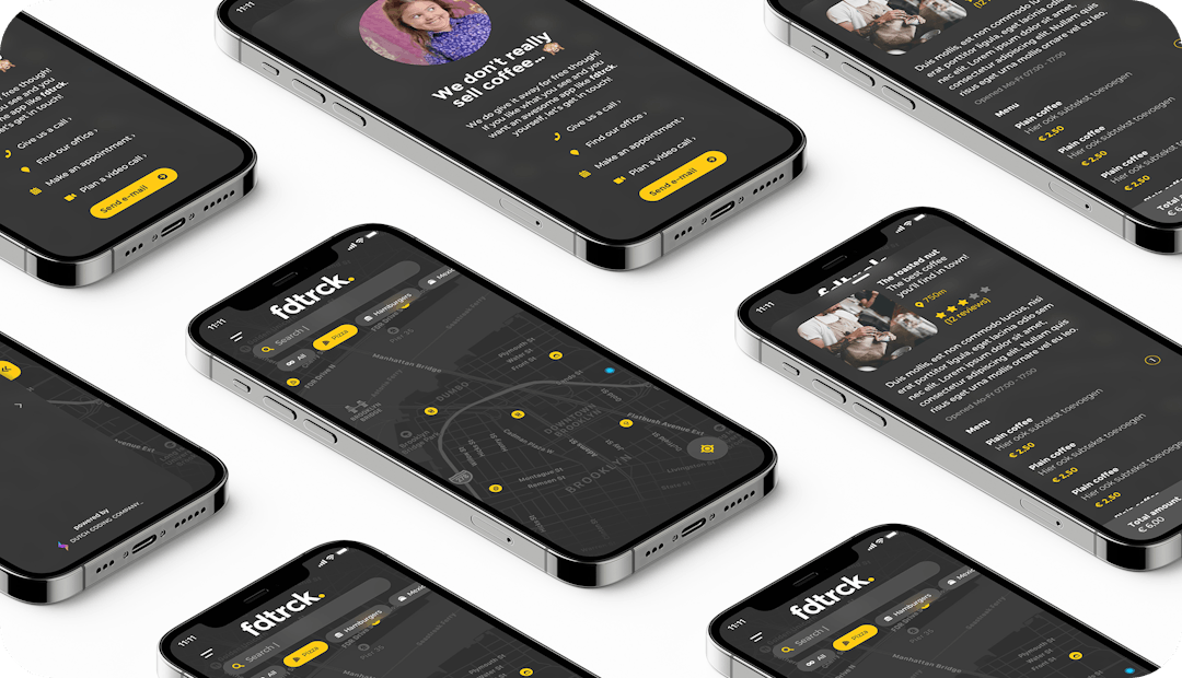
To keep the interface consistent, we often create a design system. In this design system we create implementations of the brand for all visual UI elements, such as typography use, colors, different components like buttons and cards, etc. We then use those building blocks in accordance with the positioning from the wireframes to create a beautifully designed, intuitively working application. Voila! Looks great, doesn’t it?
Usability testing
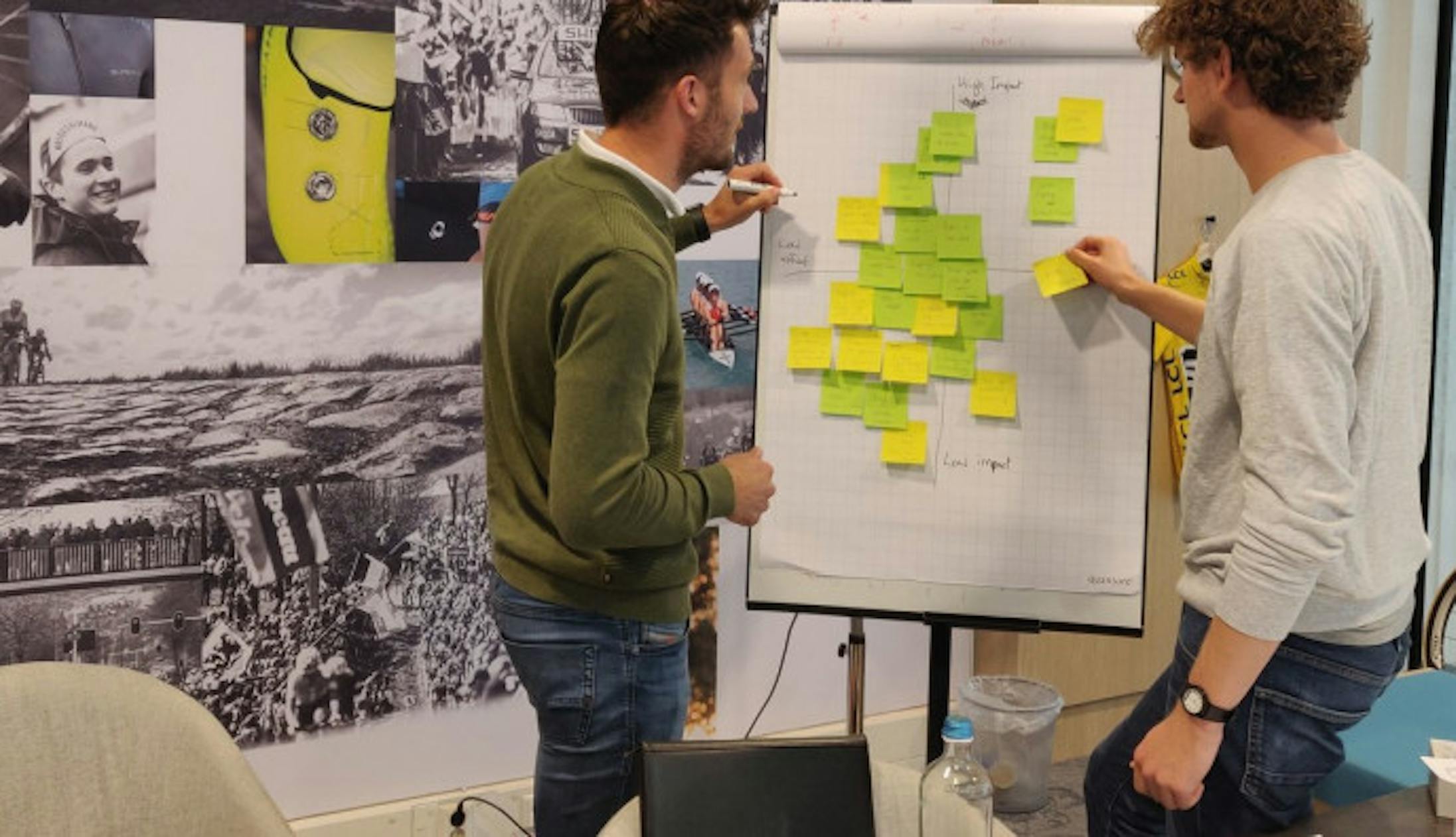
Of course, our app will only be as good as our users think it is. So the mantra here is to test, test, and then test some more. We made the designs clickable, meaning they can be navigated as if it were a real app, except it doesn’t work: you can’t really order any coffee or find a food truck nearby. It’s just smoke and mirrors at this point.
We then asked random people from our target audience to place a (fake) order, or find a food truck that serves vegan tacos. We analyzed how people navigate the screens and take note where people linger, get confused, or lose interest entirely. After the first tests, we made adjustments and tested again, with other random people. Now, this is a relatively small app, so we didn’t need to iterate a lot, but it’s all a big pretend game anyways (remember?).
In conclusion
Even though in the end, the looks of the app seem the most important, it’s not the only thing that matters for a great user experience. The wireframes greatly determine the usability of the digital product. No amount of visual sugar is going to make up for a poorly designed user flow. That said, the looks of your app are going to make the difference between a usable app and a great app.
Just so you know: we only do great apps.
 Martijn Imhoff
 Bas de Vaan
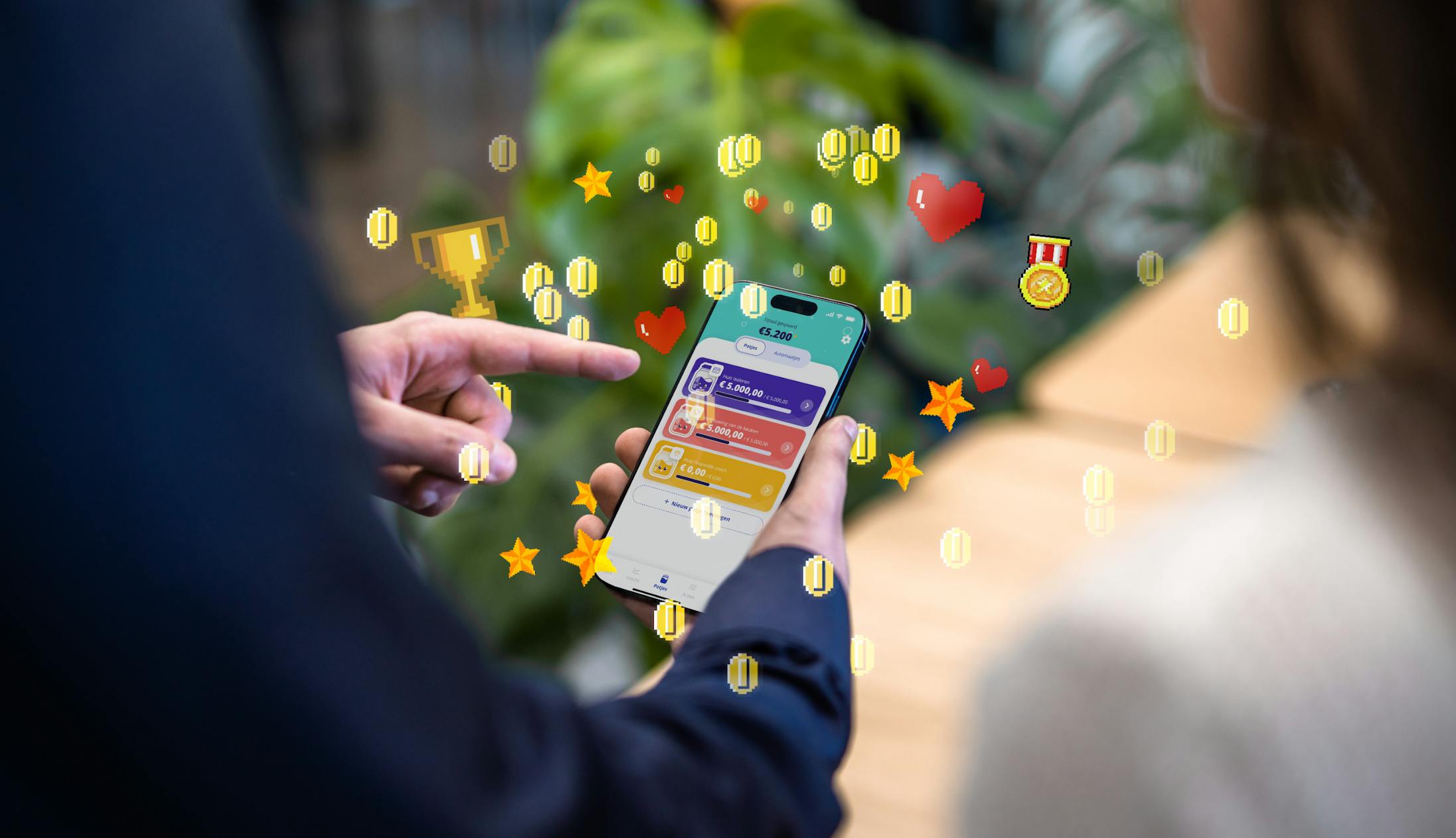
 Katja van Weert